On Living With the Gerald Charles SA Maestro GC Sport Ref. GC2.0-TX-TN-08-GR
An object either belongs in your space or it does not.
There is no marketing strong enough to force that outcome. No limitation number persuasive enough to manufacture permanence.
Some watches perform immediately. They command attention across a table. They photograph well. They announce value.
Others do something quieter.
They settle.
The Maestro GC Sport Clay did not impress me first on the wrist.
It impressed me on my desk.
I opened the box in the morning. By evening, it was resting beside my laptop. And I could still smell the strap.
A faint trace of vanilla.
We rarely speak about scent in watchmaking. We speak about finishing, mechanics, lineage. We debate heritage and resale curves. Yet ownership is sensory before it is analytical. You feel weight. You hear the clasp. You see light move across a dial. And sometimes, unexpectedly, you smell it.
That detail stayed with me.
Not because it was dramatic.
Because it was human.
Form Without Nostalgia
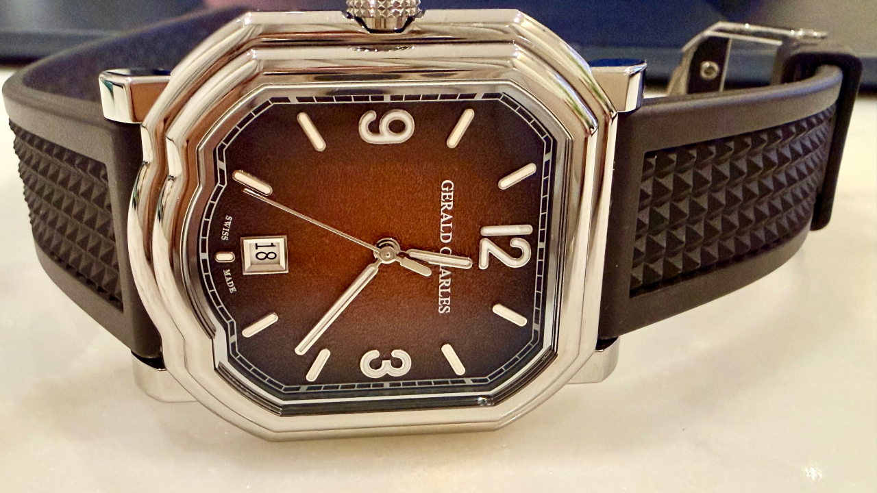
The Maestro case is immediately recognizable.
The curved lower contour, originally drawn by Gérald Genta, interrupts symmetry without collapsing balance. It feels architectural. Structured. Intentional.
Many heritage shapes either become frozen relics or diluted reinterpretations.
Under Federico Ziviani, with Octavio Garcia shaping the contemporary execution, the Maestro has been refined rather than reimagined. The case avoids nostalgia without abandoning its origin. The surfaces are cleaner. The transitions between brushed and polished planes are sharper. The geometry feels more disciplined.
It is not imitation.
It is continuation.
In Grade 5 titanium, the personality shifts again. Titanium removes visual weight. At 8.7 millimeters thin, the watch sits close to the wrist, almost disappearing physically while maintaining visual authority.
Titanium is unforgiving. If finishing lacks precision, it exposes it instantly.
Here, the edges hold. The brushing is even. The polished bezel catches light with clarity.
In ordinary desk lighting, without boutique theatrics, the structure remains convincing.
That is the real test.
The Dial and the Discipline of Restraint
The fading russet dial is not designed to dazzle.
It darkens at the perimeter and warms toward the center. The transition feels compressed into the surface rather than layered on top of it. There is depth, but no exhibitionism.
In certain light, it resembles compacted clay after play. Darker where motion gathers. Lighter where light rests.
The applied baton indexes are crisp. The Arabic numerals at 3, 9, and 12 introduce rhythm without ornament. The white Super-LumiNova remains restrained during the day and glows green at night. It serves its purpose without theatrics.
The printed minute track remains sharp across tonal shifts. The white date disk with black numerals does not attempt disguise. It accepts its function.
Nothing on this dial is asking to be admired.
It is asking to be observed.
That distinction matters.
Design That Serves Use
The reversed crown placement is not a visual flourish.
On the wrist, it avoids pressure. It disappears during movement. The clay court reference becomes credible here not because it is explained, but because it works.
Design that depends on explanation is fragile.
Design that works in silence endures.
Material, Reconsidered
Rubber is often treated as an afterthought in luxury watchmaking.
Here, it is integrated.
The chocolate brown HNBR strap complements the warmth of the dial rather than competing with it. The Clou de Paris texture adds structure without aggression. The underside tapisserie pattern is subtle, almost private.
The taper from 22 to 20 millimeters keeps proportions disciplined. The reduction in thickness toward the buckle respects the thin case architecture.
And the scent remains.
It sounds insignificant until you experience it.
But tactile finishing shapes ownership more than we admit.
This watch understands that collecting is not only visual.
It is physical.
Turn It Over
Through the sapphire caseback, the movement presents itself without pretense.
The gold rotor, geometric and structured, contrasts with the cooler steel components. The brushing is clean. The jewel settings are precise. The architecture is graphic and modern.
It is not pretending to be something else.
It is mechanical. Deliberate. Honest.
There is strength in that clarity.
Beyond Scarcity
Yes, it is limited to 200 pieces. Yes, it is sold out.
Scarcity creates urgency.
Urgency does not create permanence.
What creates permanence is coherence.
The titanium supports the sport identity. The gradient supports the warmth of the strap. The crown placement supports wearability. The thinness supports the design language.
Nothing contradicts itself.
That is rare.
In collecting, discernment is not about chasing what is difficult to obtain.
It is about recognizing what is complete.
Why It Endures
There are watches that impress in a display case.
There are watches that impress online.
And there are watches that sit quietly beside you while you work and feel correct in that space.
This one did not demand my wrist immediately.
It earned it.
It settled on my desk before it settled on my wrist.
And in time, that is what separates performance from permanence.
— Mohammed Almarwani, ACIArb, CEO, AllChrono