Some watches reveal themselves slowly.
Others make their argument the moment light touches the dial.
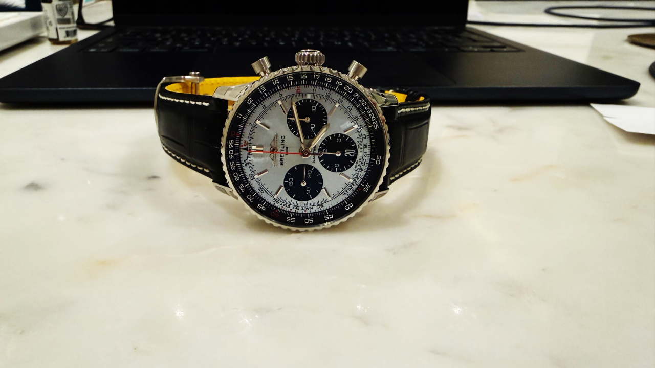
My Breitling Navitimer B01 Chronograph 41, in this ice blue execution, belongs to a rare third category. It does not simply reveal itself. It changes while you are looking at it.
That is the part I was not prepared for.
I have handled many blue dials over the years. Navy blue, lacquer blue, sunburst blue, petroleum blue, metallic blue, and the pale blue shades that have become increasingly popular across the watch industry. Some are elegant. Some are fashionable. Some photograph beautifully and then lose part of their magic in real life.
This dial does the opposite.
It is difficult to capture because the colour refuses to stay still.
Turn the watch slightly and the ice blue becomes silver. Move it again and the blue rises from underneath the surface. Tilt it one more time and the dial becomes colder, sharper, almost glacial, as if the colour is not painted onto the watch but suspended somewhere inside the metal.
Every direction gives you a different version of the same watch.
I have not seen many dials behave like this.
And I do not say that lightly.
The remarkable thing is not simply that the colour changes. Many sunburst dials change under light. What is different here is the speed of the change. The dial reacts immediately. It does not need a studio, direct sunlight, or a carefully staged photograph. Even in an ordinary room, with ordinary reflections, the watch begins to move.
That movement matters because the Navitimer itself is already a watch of movement.
It was never designed as a quiet object. It was born from aviation, calculation, timing, distance, fuel, speed, conversion, judgment. Willy Breitling developed the original wrist-worn chronograph with a circular slide rule in 1952 so pilots could perform essential flight calculations on the wrist. Two years later, the Aircraft Owners and Pilots Association adopted the design as its official timepiece, and the “navigation timer” became the Navitimer.
That history still sits inside the watch.
The slide rule bezel is not decoration. The scales are not ornamental nostalgia. The density of the dial is part of the Navitimer’s identity. Some watches use empty space to create elegance. The Navitimer creates elegance through organized complexity.
That is not easy.
There is a fine line between a dial that feels technical and a dial that feels crowded. The Navitimer survives that line because its complexity has purpose. Every scale, every numeral, every ring, every sub-dial belongs to a larger instrument language.
This is why the ice blue dial could have gone wrong.
A colour this beautiful can easily soften a watch too much. It can turn a serious chronograph into a decorative object. It can make the conversation about the colour and not the watch.
But here, Breitling did something far more difficult.
The colour does not fight the Navitimer.
It understands it.
The ice blue gives the dial air. It opens the architecture. It allows the eye to move through the information without feeling trapped by it. The black sub-dials bring back discipline. They anchor the softness of the blue and return the watch to its aviation character. The red chronograph seconds hand cuts through the centre with just enough urgency to remind you that this was always an instrument before it became an icon.
That small red line is important.
Without it, the dial might become too calm.
With it, the watch has pulse.
Then there is the case size.
For me, 41 millimetres might be the perfect modern Navitimer proportion. Large enough for the dial to breathe. Large enough for the slide rule to feel alive. But restrained enough to keep the watch elegant on the wrist.
The Navitimer needs presence. It should not be timid. But presence is not the same as size. Presence is proportion, confidence, balance, and the ability to hold complexity without becoming loud.
At 41 mm, this watch finds that place.
It carries the old aviation romance without becoming costume. It has the technical density of the Navitimer, but not the heaviness that can sometimes make complicated chronographs feel like equipment rather than watches.
The flattened slide rule and domed crystal help. They make the profile feel sleeker than the amount of information on the dial would suggest. The polished and brushed surfaces give the case a controlled light, not a flashy one. The watch has shine, but it does not feel desperate for attention.
That restraint is part of why the dial works so well.
Ice blue, when overdone, becomes decorative. On this Navitimer, it becomes atmosphere.
There is a difference.
A decorative dial is there to attract the eye. An atmospheric dial changes the emotional temperature of the watch. It gives the object a different mood without taking away its original identity.
That is what this watch does.
It does not make the Navitimer simpler.
It makes it more resolved.
And that distinction matters. The Navitimer should never be simplified too much. Its soul is in its complexity. Remove too much, and you no longer have the same watch. You have a cleaner object, perhaps, but not necessarily a better one.
The beauty of this version is that it respects the disorder that made the Navitimer famous, then brings refinement to it.
The AOPA wings at 12 o’clock add historical weight. The tri-compax layout gives the dial symmetry without making it sterile. The outer scales preserve the watch’s cockpit intelligence. The colour brings light. The sub-dials bring gravity. The red hand brings action.
Everything has a role.
That is what I mean by execution.
In watches, people often speak too quickly about colour. They say a dial is beautiful, rare, trendy, collectible, or photogenic. But colour alone is not enough. A dial colour must belong to the watch. It must serve the architecture, the case, the hands, the indexes, the history, and the emotional character of the piece.
This ice blue belongs.
That is why I believe it may be the best executed ice blue dial I have personally encountered.
Not because it is the most dramatic.
Not because it is the loudest.
Because it is alive without becoming theatrical.
There is something almost impossible about the way it shifts. In one moment, the watch feels technical and cold. In another, it feels soft and luminous. Then the black sub-dials pull it back again, and suddenly the Navitimer is no longer just a blue-dial chronograph. It becomes a piece of aviation design under changing light.
That is where the emotional part begins for me.
The Navitimer has always lived between function and style. It was worn by pilots, but it also found its way onto the wrists of people far outside aviation. Airline captains understood it. Aircraft enthusiasts admired it. Scott Carpenter took a Navitimer into space in 1962. Miles Davis and Serge Gainsbourg wore it with the kind of ease that only certain objects can carry.
That is the strange power of the Navitimer.
It is highly specific, yet culturally open.
A pilot can read it as a tool.
A collector can read it as history.
A designer can read it as architecture.
A musician could wear it as attitude.
And today, in this 41 mm ice blue version, I read it as balance.
Balance between nostalgia and modernity.
Balance between complexity and refinement.
Balance between instrument and beauty.
The watch still has its old language, but the tone has changed. It feels more composed. More architectural. More elegant than one might expect from a Navitimer, yet still unmistakably a Navitimer.
That is not an easy achievement.
Many modern updates either over-polish the past or over-protect it. One makes the watch lose its character. The other traps it in memory. This version avoids both. It allows the Navitimer to breathe in the present without apologizing for where it came from.
And perhaps that is why I keep returning to the dial.
The colour keeps changing, but the identity does not.
That is the secret.
Every angle gives a new shade, but never a different watch. Silver, blue, glacial, metallic, soft, cold, luminous. The surface moves, but the Navitimer remains anchored.
For me, that is what great execution looks like.
Not novelty.
Not noise.
Not a colour added for attention.
A watch where every decision seems to know the history behind it and the wrist in front of it.
The Breitling Navitimer B01 Chronograph 41 in ice blue is not merely a beautiful version of a famous watch. It is a reminder that refinement does not always mean restraint in the obvious sense. Sometimes refinement means allowing complexity to remain, but giving it light, proportion, and breath.
This watch does that.
It carries aviation history without becoming old.
It carries colour without becoming fashionable.
It carries complexity without becoming confused.
And every time I turn it, the dial changes before my eyes.
That is what stays with me.
Not just the blue.
The movement of the blue.
And in a watch born from navigation, timing, calculation, and flight, perhaps that is exactly why it feels so right.
— Mohammed Almarwani, ACIArb, CEO, AllChrono